DrinX

Transforming Drinks into Loyalty: A Rewarding Experience for Nightlife Lovers

DrinX is a startup that has developed a mobile application to build customer loyalty not only in the context of nightlife, but also in other social and consumption situations. The app introduces a loyalty system that allows users to accumulate points every time they purchase drinks at a network of partner venues. These points can then be redeemed for free drinks, transforming the consumption experience into something more rewarding and engaging. I was asked to design the UI of the app and website for DrinX, a platform that caters to a wide and diverse audience, from young people to adults. Considering that the legal age for attending venues and consuming drinks generally varies from 18 to 35+, the design must be able to attract and engage users with different tastes and needs.

The Challenge

The challenge in this project was to find an identity that could appeal to both young people, with a modern and attractive aesthetic, and adults, evoking a sense of nostalgia and familiarity. Furthermore, the main goal was to make the gamification system simple and intuitive, ensuring that the mechanism of accumulating and redeeming points to obtain free drinks, where vouchers are activated when the necessary points are reached, was easily understandable for all users. In these cases, it is important to design a smooth purchasing process to ensure a satisfying and uncomplicated user experience.

The Strategy

DrinX, a startup focused on customer loyalty in social and consumption settings, faces the challenge of creating an app that is both accessible and appealing to a diverse audience, ranging from young adults to more mature users. The main difficulty lies in balancing a modern and attractive aesthetic that resonates with a younger crowd, while also evoking a sense of nostalgia and familiarity for an older demographic. Additionally, the gamification system, which allows users to accumulate points to earn free drinks, must be intuitive and easy to understand, ensuring a frictionless user experience.

The Solution

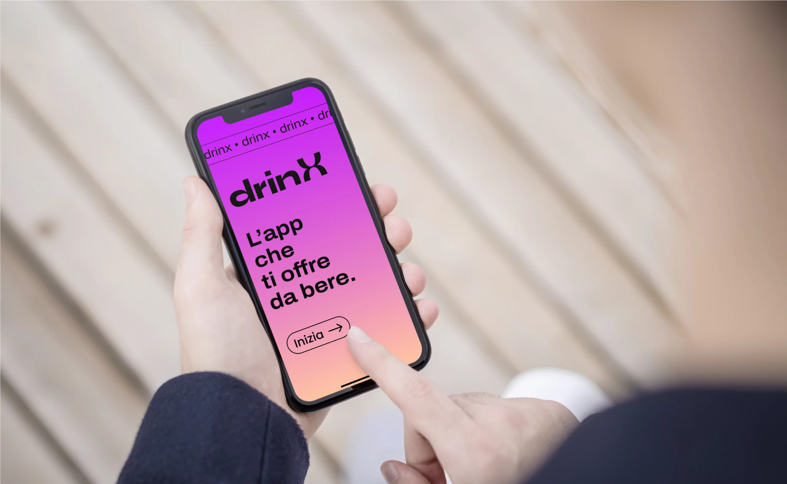
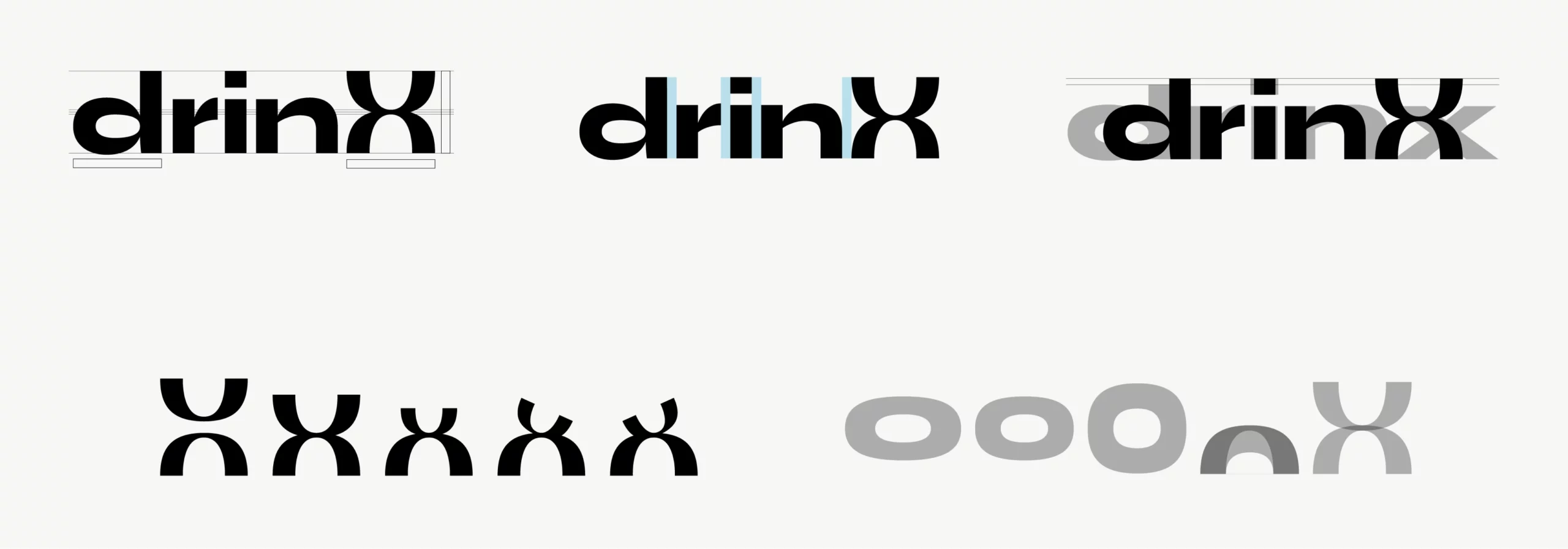
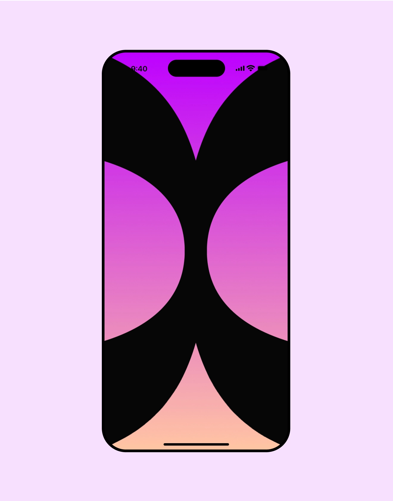
To address this challenge, DrinX’s UI was designed with a strong and flexible visual identity. The logo features a modern font in lowercase to create a friendly and approachable effect, balanced by the uppercase “X,” symbolizing the brand’s potential for future expansion. The color palette combines a vibrant fuchsia with a soft pastel orange to evoke both energy and warmth, reflecting the liveliness of nightlife and the comfort of the consumption experience. The dynamic “X,” inspired by the top-down view of two glasses clinking, becomes an iconic symbol that celebrates moments of connection, making the brand memorable and engaging.

<span data-metadata=""><span data-buffer="">The identity

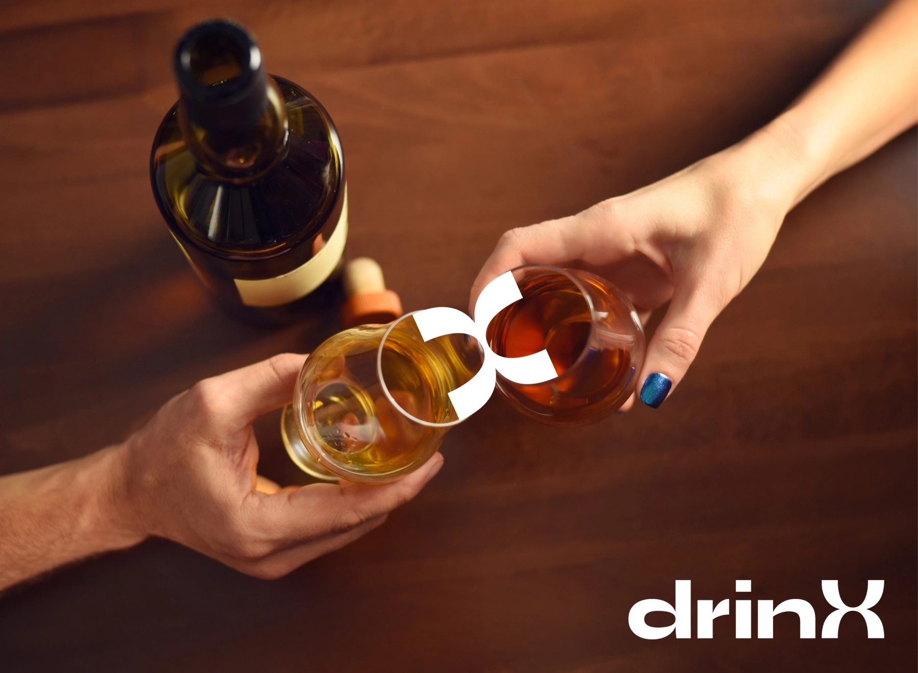
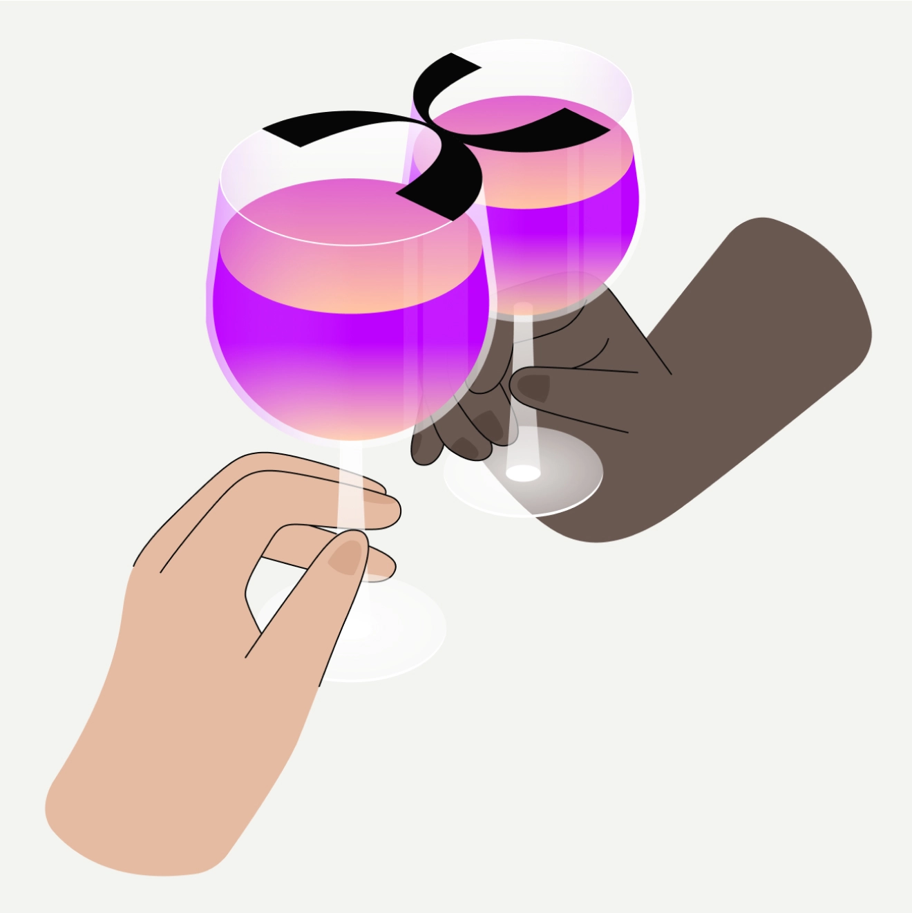
Even before creating the app, DrinX needed a strong and recognizable identity, and that’s where I started. The logo takes shape through a modern, powerful font, capable of communicating presence and fun. The choice to keep the “X” in uppercase reflects the long-term vision of the project, allowing future expansions of the brand into other sectors. All you need to do is change the word preceding the “X” to maintain brand consistency, for example: drinX, eatX, etc. This ensures a strong visual identity and great flexibility for future evolutions. To create the shape of the “X” in the logo, I was inspired by the view from above of two glasses toasting. By cutting the glasses in half, you get an “X” which I then animated to make the logo more engaging. I choose “toasting” as a scene, because is a universal gesture that is always done with glasses, regardless of the product featured in the service, and it’s joyful and positive. In this way, the “X” becomes an iconic element that represents not only the brand, but also the moment of connection and celebration, fundamental in any consumption experience offered by DrinX and potentially by future expansions such as eatX or other variants.

Branding and Neo-Brutalism Style

I chose a color palette that combines a vibrant fuchsia and a pastel orange for the brand. The fuchsia transmits energy and liveliness, reflecting the atmosphere of nightclubs, while the pastel orange adds a welcoming contrast, balancing intensity with warmth. This combination represents the innovation and vivacity of DrinX, with black continuing to maintain its relevance in the graphic context, starting with the brand.

To reach a wide audience, I chose the graphic style of neo-brutalism for the brand identity and user interface. This distinctive approach differentiates the brand and makes the experience memorable, with a bold and visually impactful design, just like those who want to be the life of the party.

Young (18-25 years): Neo-brutalism reflects a contemporary, bold and eccentric aesthetic, which reflects the bold spirit of today.

Adults (26-40 years): It evokes the nostalgia of the graphics of the first computers and video games, recalling pleasant memories linked to the digital evolution.
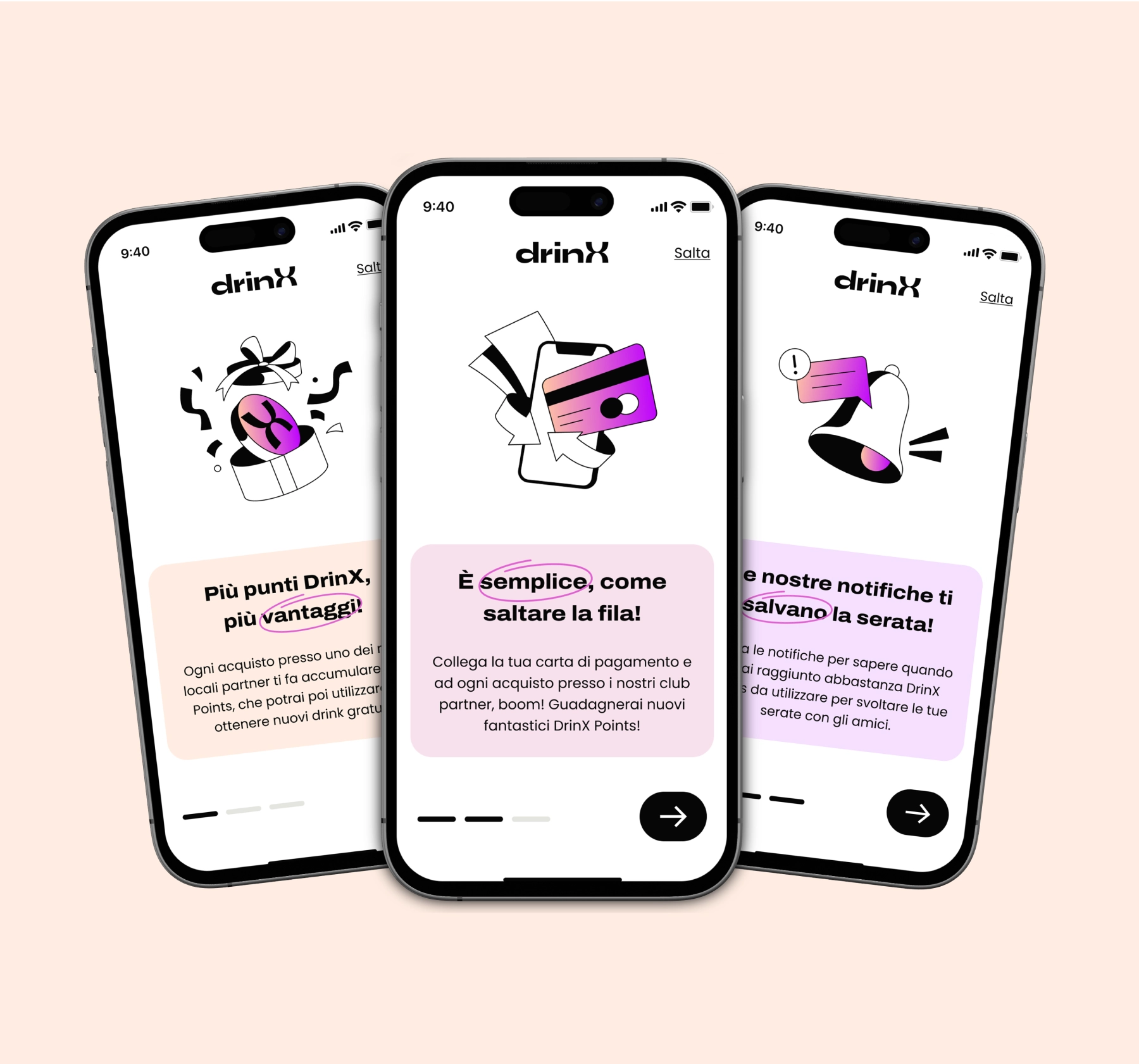
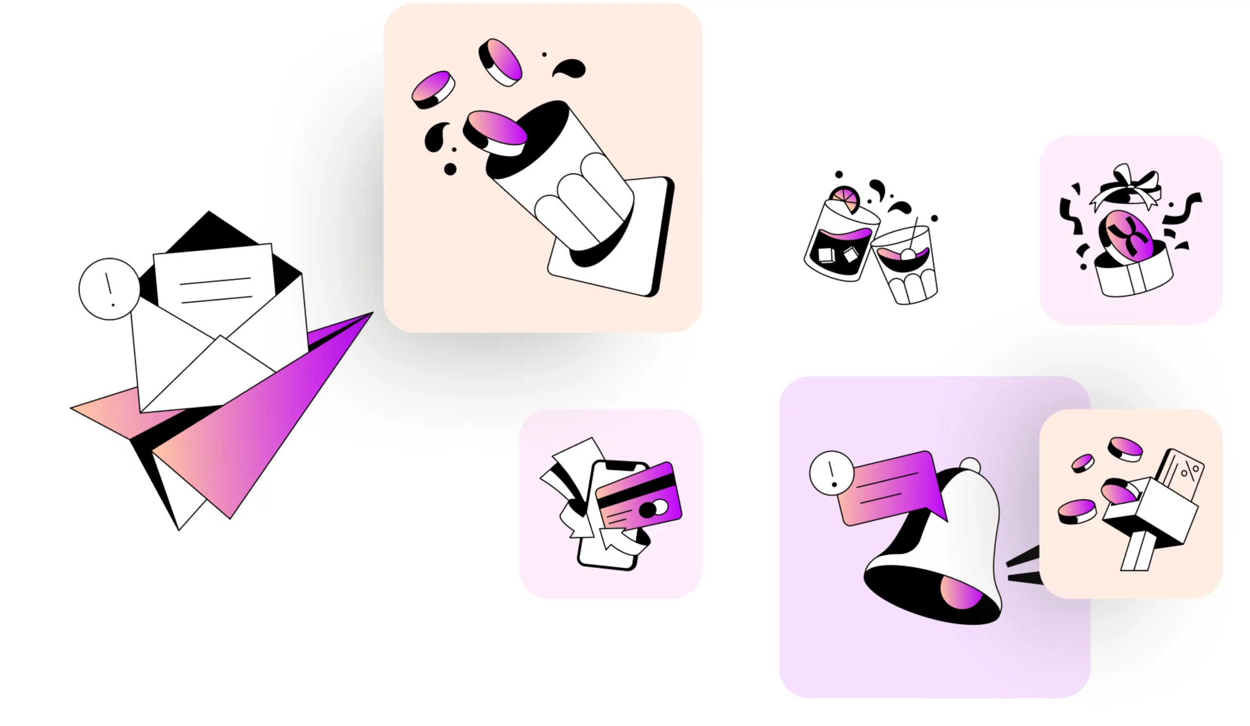
I designed an iconography that fully reflects the neo-brutalist style of the app. The icons feature clean and bold lines, with a predominance of black and white that gives a bold and minimalist look. However, to maintain a touch of liveliness and guide the user’s attention, I introduced hints of color with a vibrant gradient that emerges on the key elements of the icons. This balance between the rigor of black and white and the explosion of color reflects the energy and innovation of the brand, in line with the contemporary and bold aesthetic of neo-brutalism.

Information architecture and app development
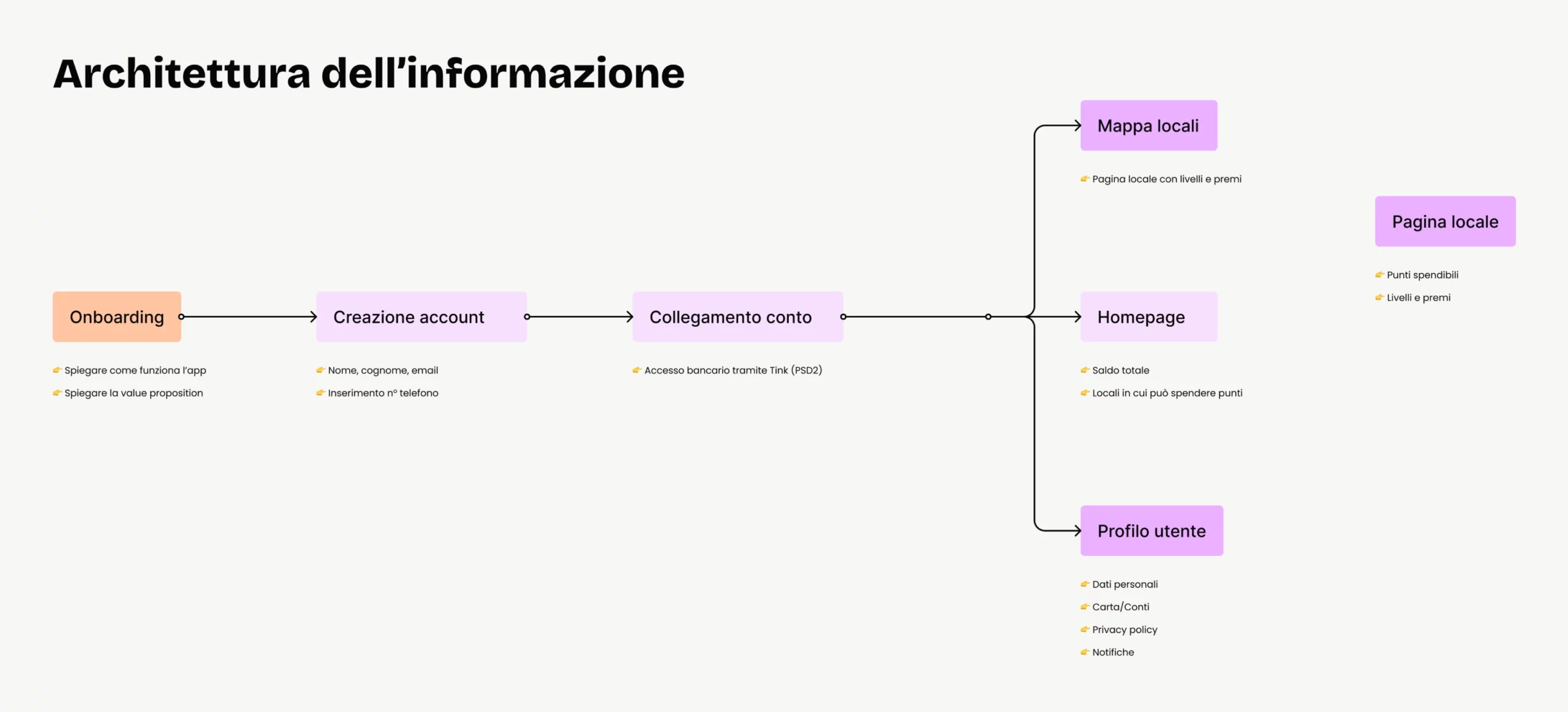
Before developing the DrinX app, we studied information architecture to organize content in an intuitive and navigable way. We created several user journey maps to understand user paths and optimize interaction with the app. This approach allowed us to design a fluid, engaging user experience tailored to the needs of our users but above all to mitigate errors during the design phase.
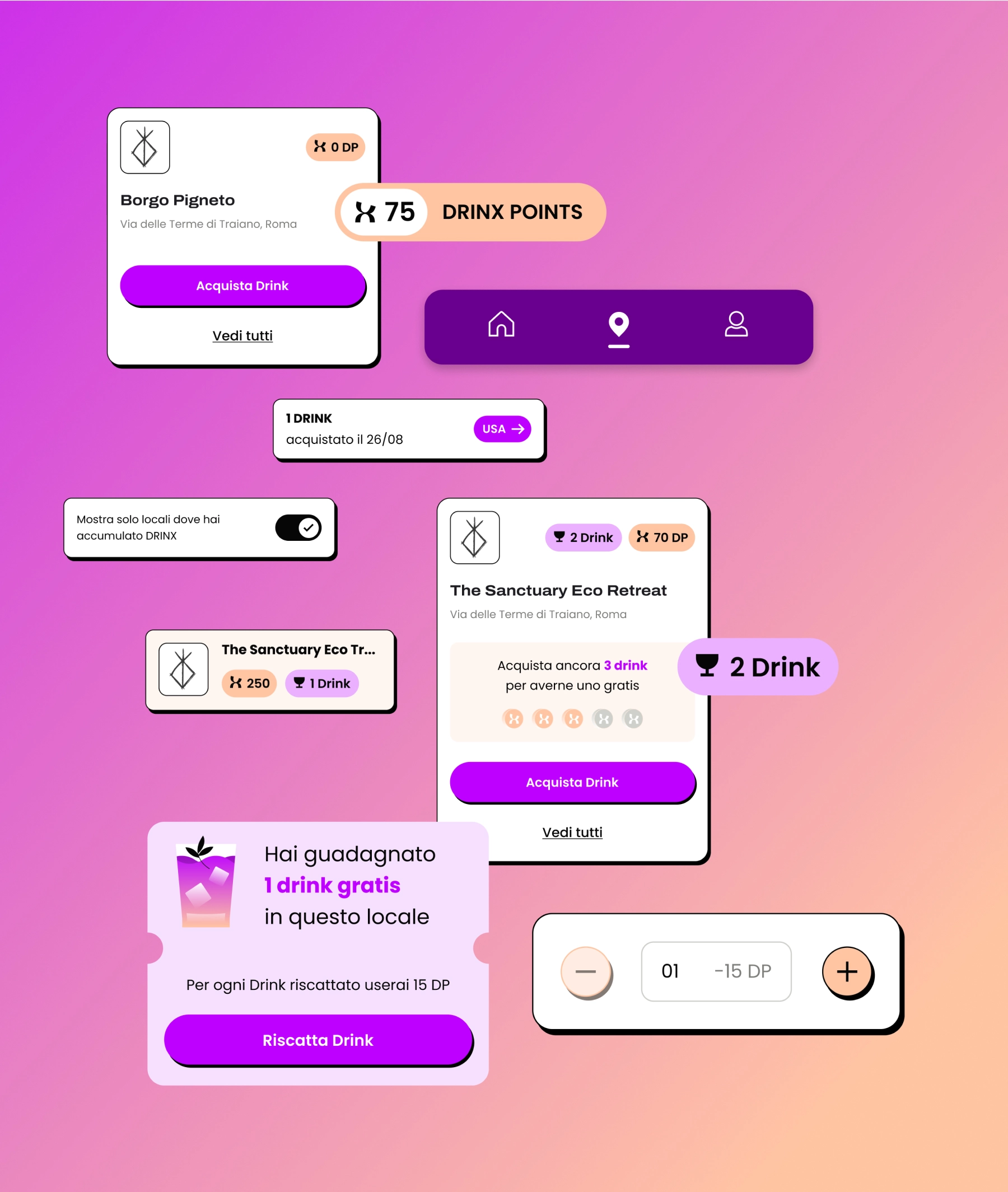
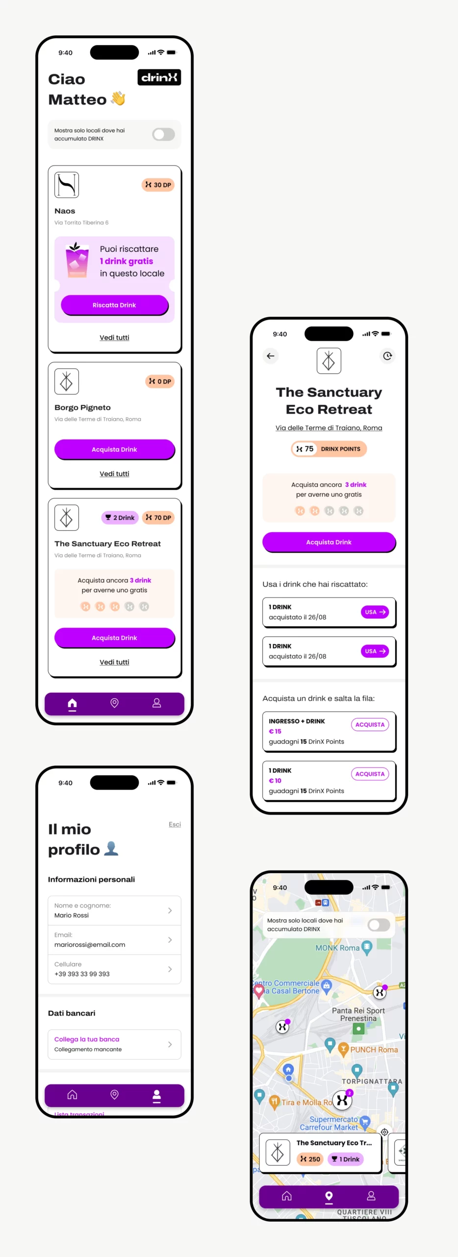
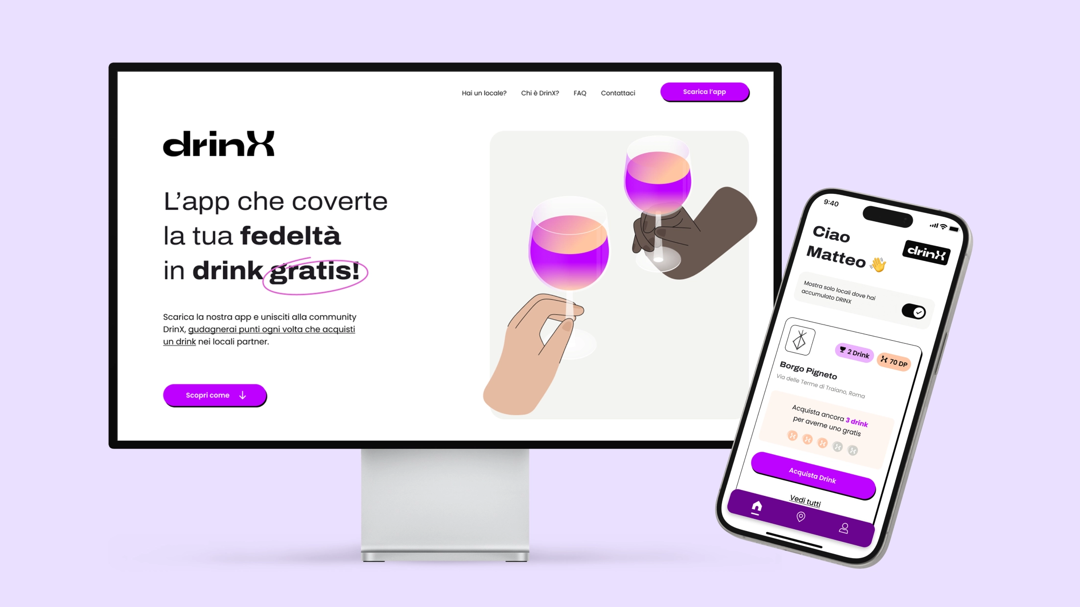
The DrinX app was designed to offer a simple and intuitive user experience, especially for those who are already in a venue and want to use the points they have accumulated quickly. On the homepage, a quick toggle allows you to view only the venues where you already have points, with those ready for redemption at the top of the list, while the cards include a “Buy Drink” CTA always at hand. On the venue detail page, two clearly defined sections clearly show the drinks obtained and additional options such as “entrance + drink” and “skip the line” packages, encouraging use of the app. On the map, to improve the experience in situations where speed is essential, we have eliminated the search field, preferring interactive pins that immediately show nearby venues. In the user profile, a list of transactions with intuitive filters allows you to easily monitor purchases, points and drinks redeemed, ensuring complete control over your activities in the app.

<span data-metadata=""><span data-buffer="">Simple and intuitive purchase flow<span data-metadata="">

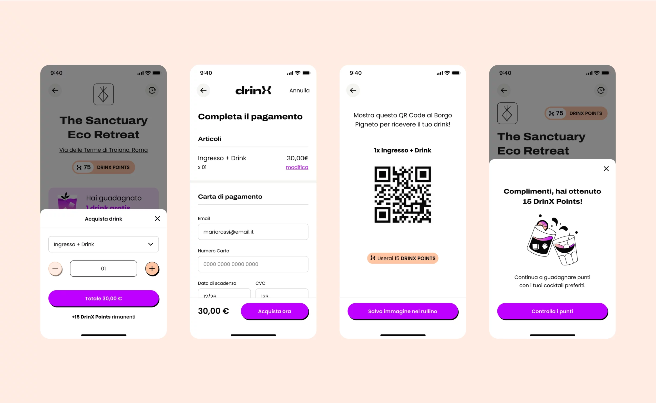
After selecting the venue and the “Entrance + Drink” option, the user sees a clear summary of the cost and the points that can be accumulated. Once the purchase is confirmed, it is possible to enter the payment details quickly. Once the payment is completed, a QR code is generated that the user can show to receive the drink. At the end, the app confirms the accumulation of DrinX points, encouraging further purchases thanks to the reward system.

<span data-metadata=""><span data-buffer="">Landing Page for Consumer and Merchant

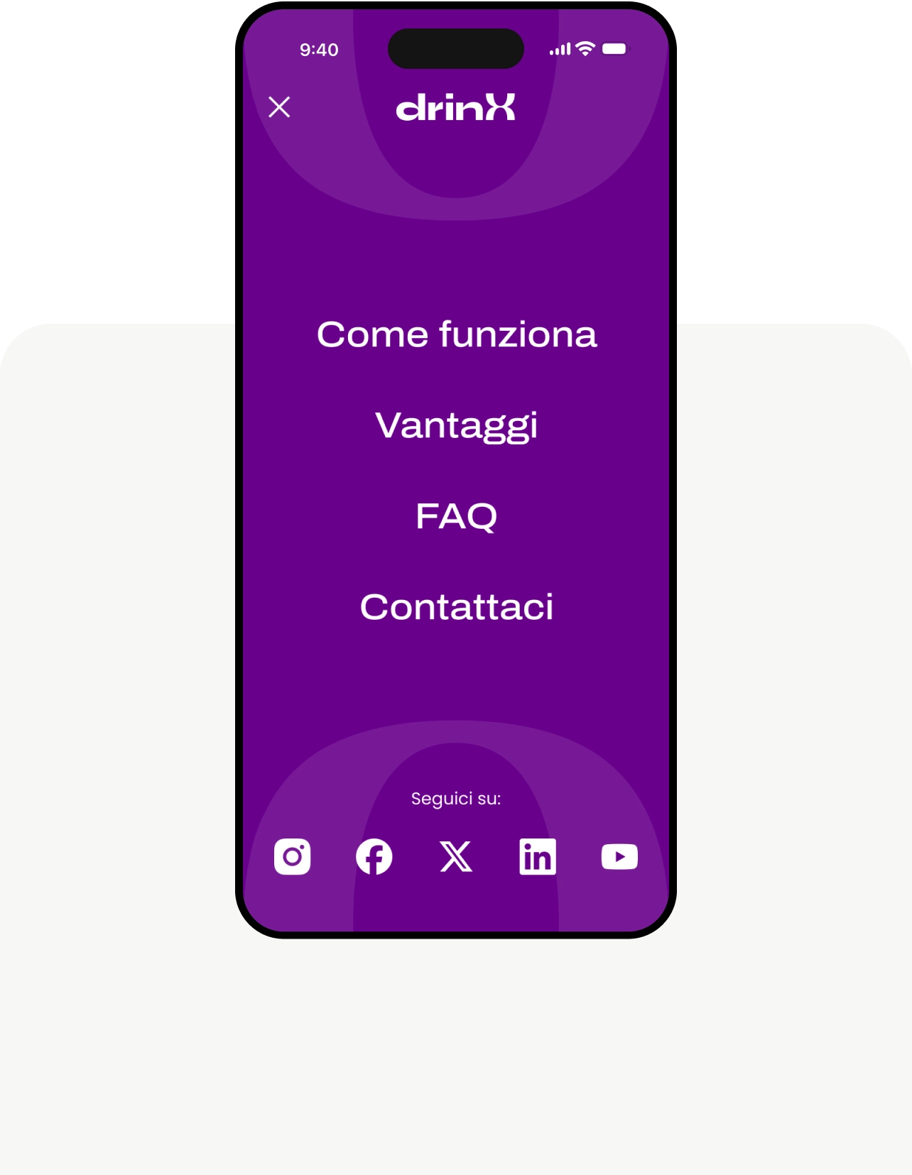
We created two separate landing pages to meet the needs of consumers and merchants and both are designed with an attractive design and a clear message, adapted to the specific needs of each target, to maximize effectiveness and attractiveness.

For Consumers: This page focuses on the DrinX reward system, clearly showing how users can accumulate points with each drink purchased and convert them into free drinks. The design includes lively images and strategic calls-to-action to encourage downloading the app and joining the DrinX community.

For Merchants: The page dedicated to merchants highlights the benefits of joining the DrinX circuit. It highlights advantages such as increased visibility, customer loyalty and access to analytical tools to optimize sales.
Where

Agency

Role

Industry

Did you like it?
Read the next
stellar project.​