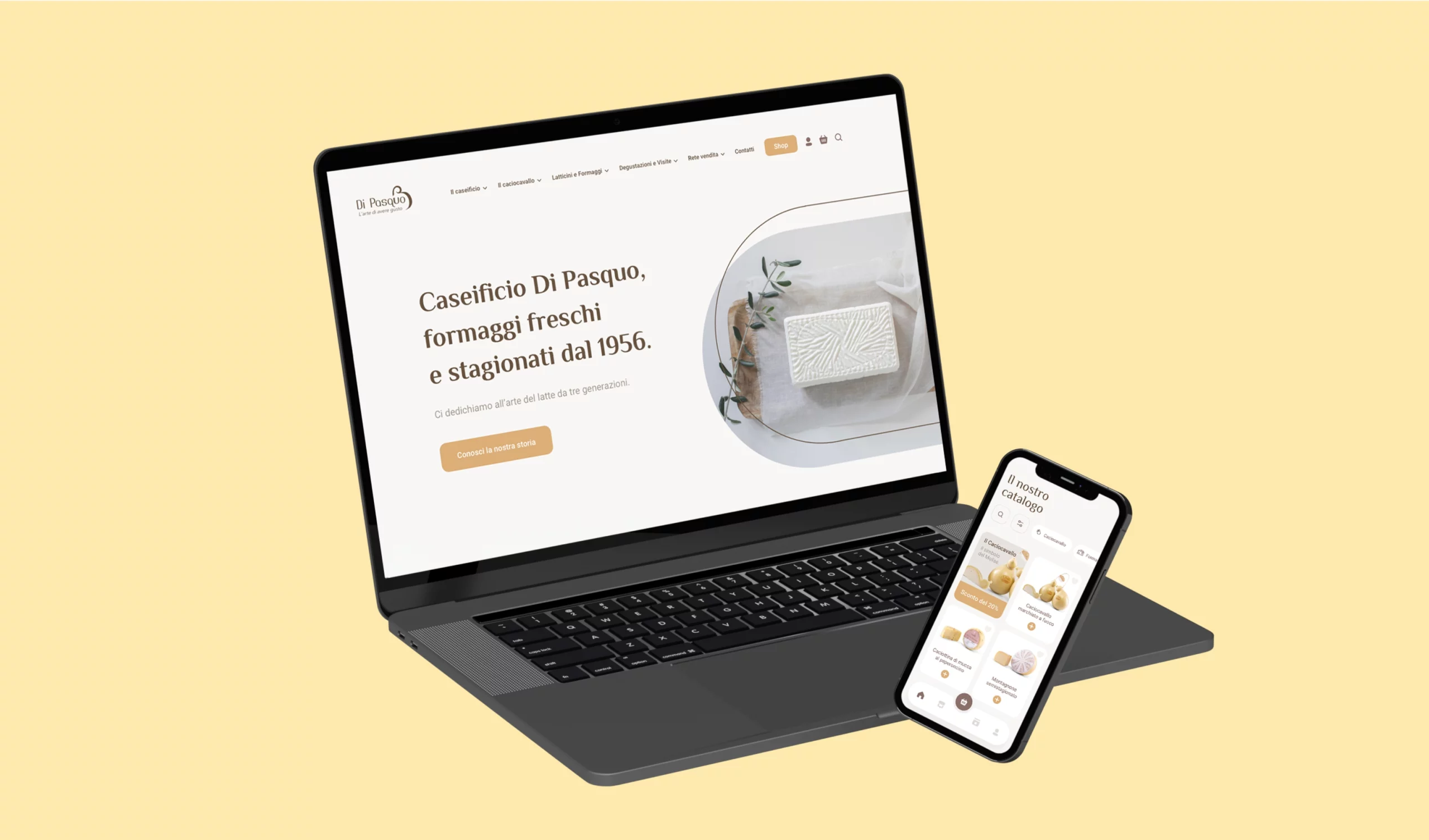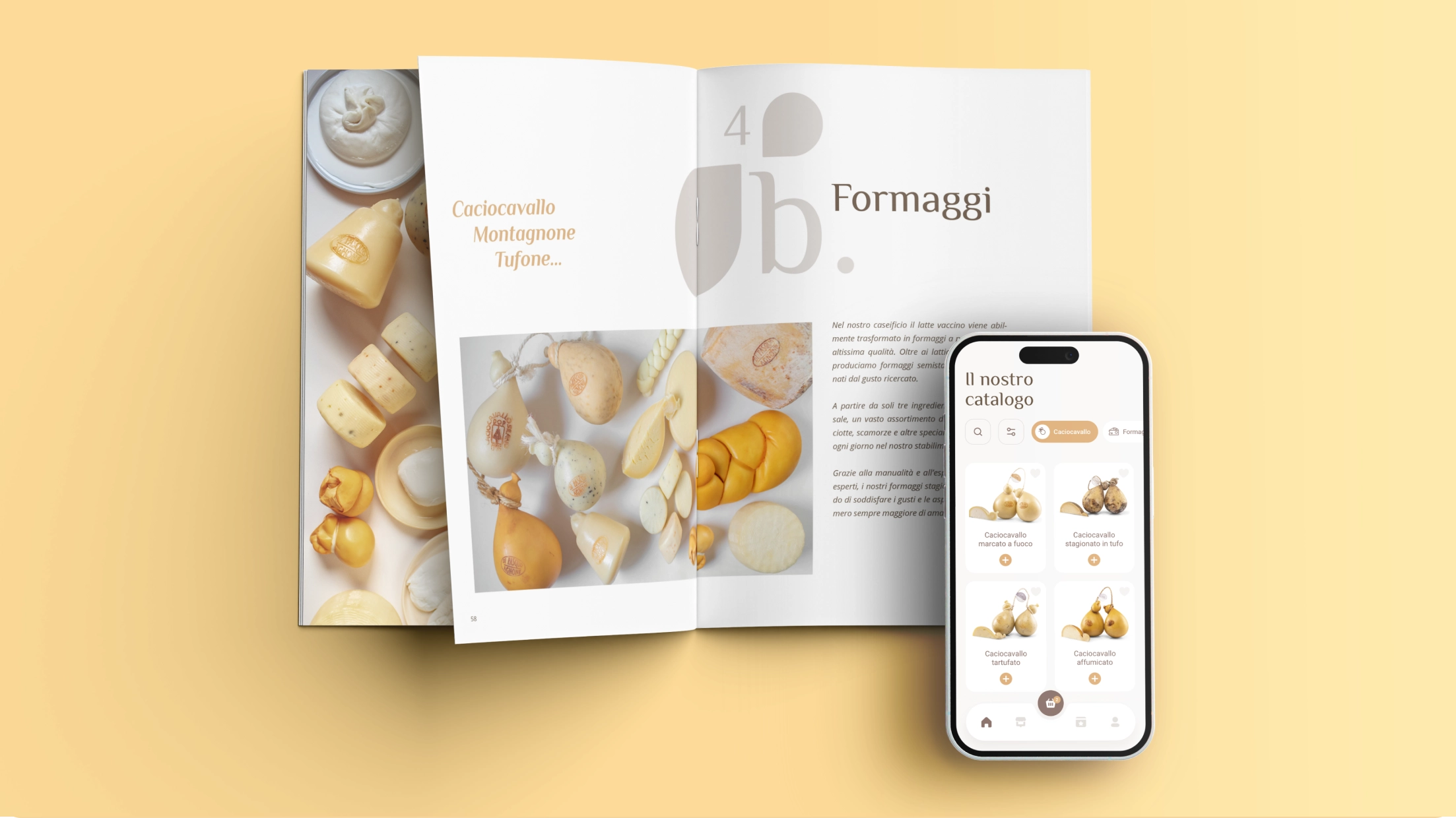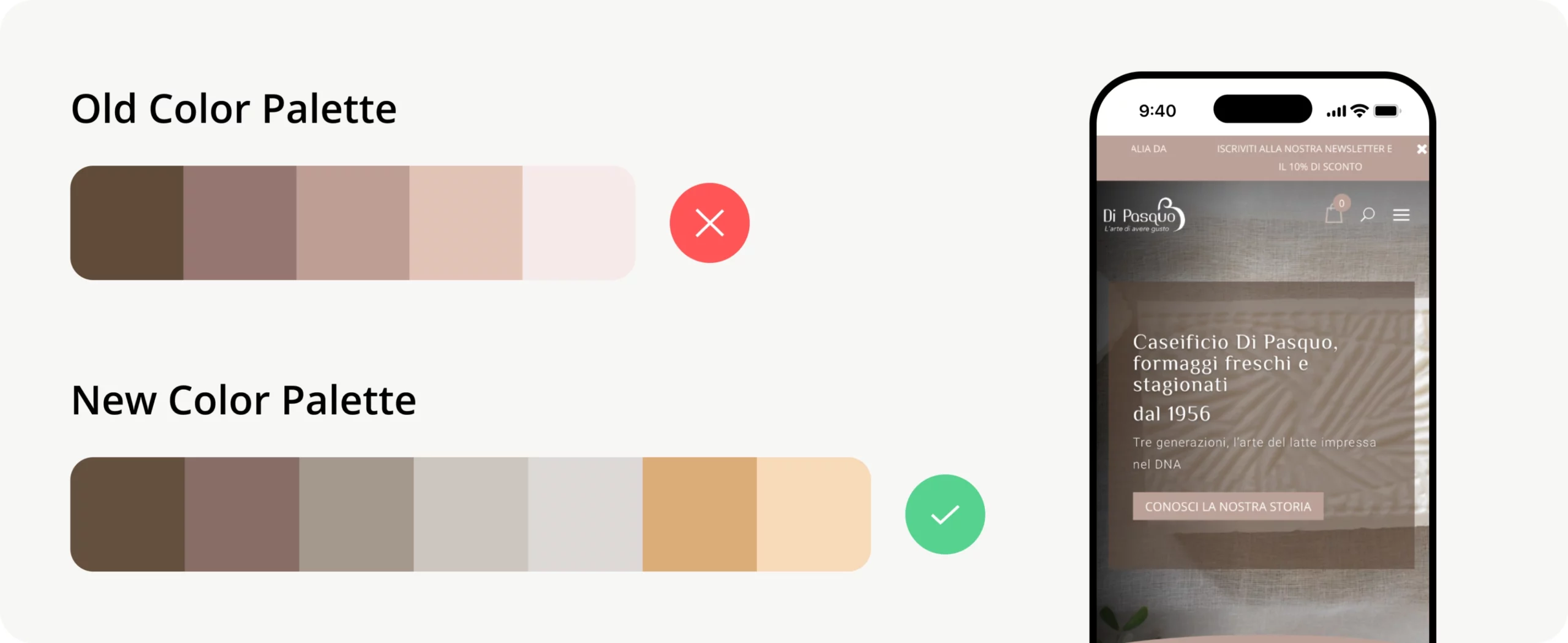
The existing digital brand assets, initially faced issues with accessibility, colors and typography choices. The color palette, leaning towards pink tones, conveyed an inappropriate message for a dairy product site.
Neuroscience reveals that flavor perception is a multisensory experience engaging taste, touch, smell, hearing, and sight. Color not only whets our appetite but also shapes our judgments and directs our decisions.
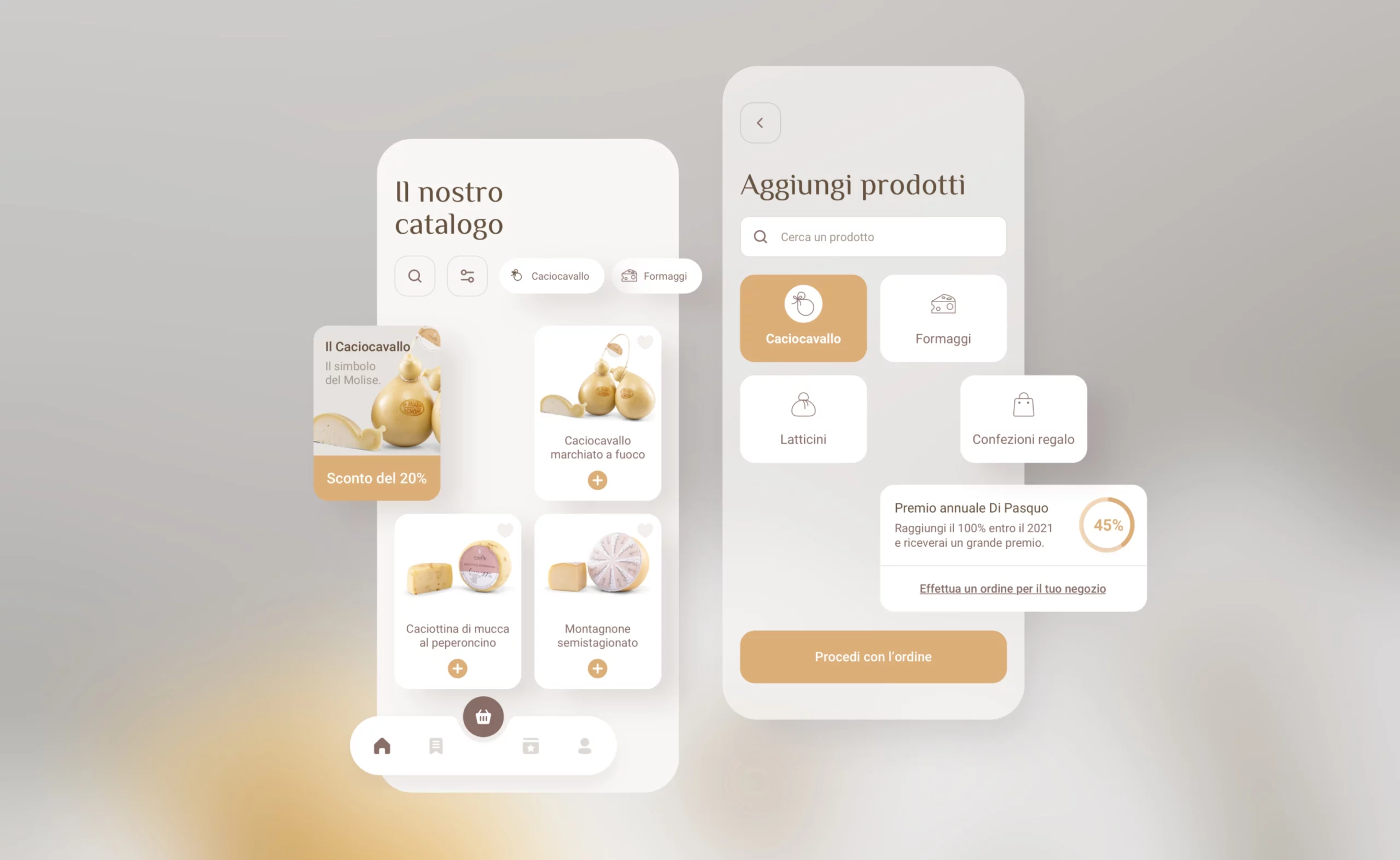
Yellow and orange hues subtly boost appetite and enhance well-being, evoking attention, warmth, and energy. Thus, I developed a new palette aligned with the brand’s essence, a choice made collaboratively with the client.
B2C User Experience
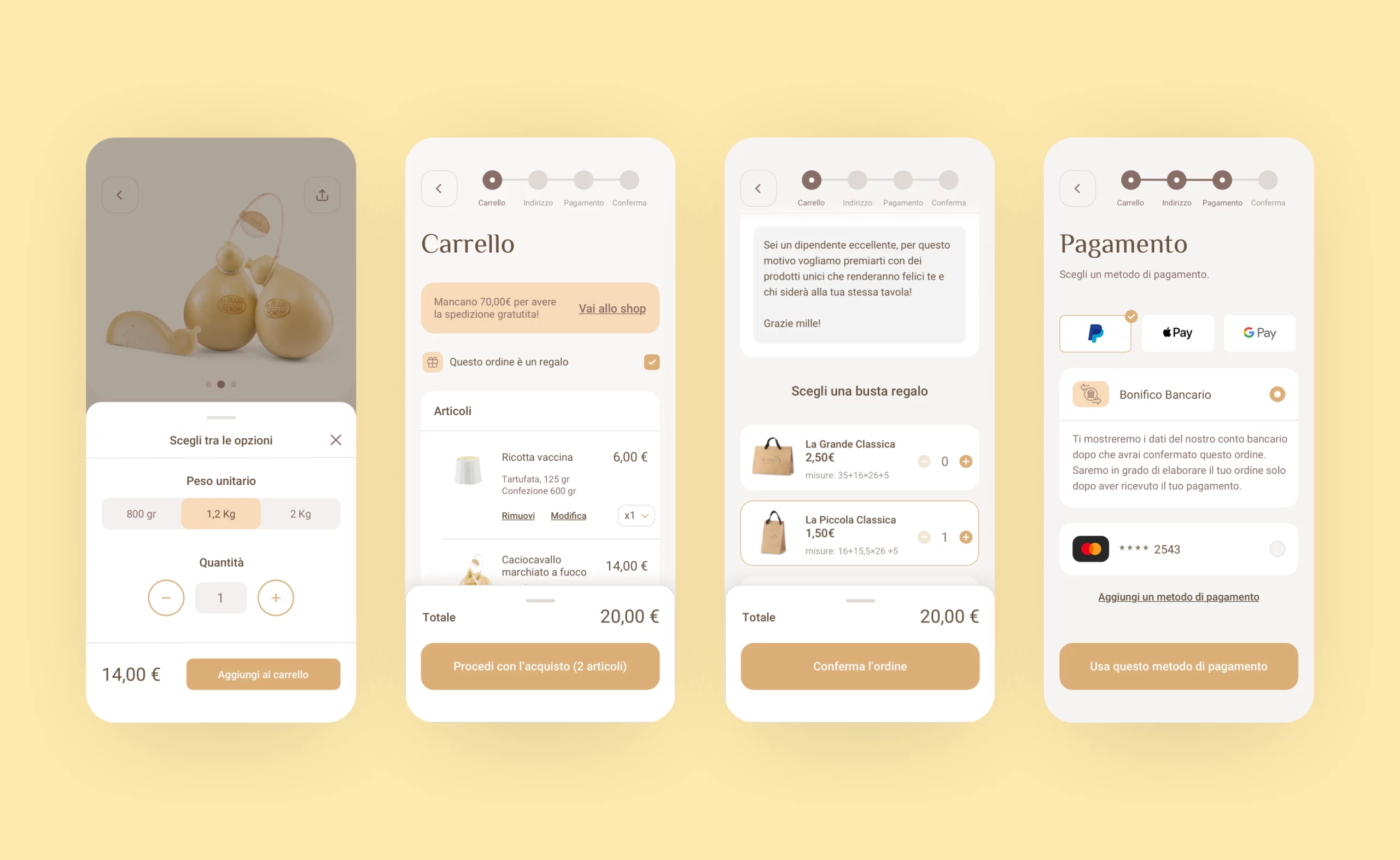
In the B2C checkout, a progress bar guides users through each step of the process, while a banner actively encourages them to add more items to their cart for additional savings or benefits. A separate and streamlined checkout flow is dedicated to allowing customers to select gift options and packaging details, enhancing the personalization of their purchase. Additionally, it’s always recommended to prominently include the coupon code field on both the cart and checkout pages to maximize user convenience and boost conversion rates.
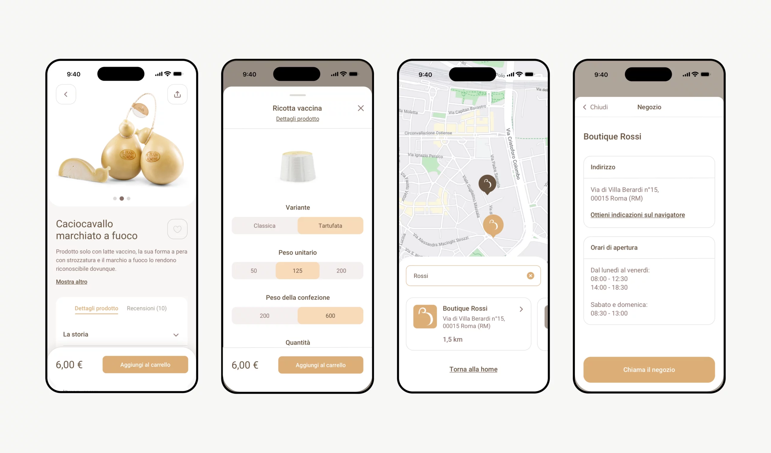
Product listings showcase high-quality images and detailed descriptions, enhancing unique product characteristics for a sensory experience. Detailed product sheets reinforce brand storytelling, while streamlined cart options simplify the purchasing process. The Store Locator enables users to easily find shops selling Caseificio Di Pasquo products, offering detailed store information and an interactive map for convenient access.
B2B User Experience
For businesses, payment arrangements such as monthly invoicing streamline the purchasing process, fostering long-term relationships. retailers to focus solely on desired goods and services. This has allowed us to create a flow that helps retailers focus solely and exclusively on the goods and services they want.
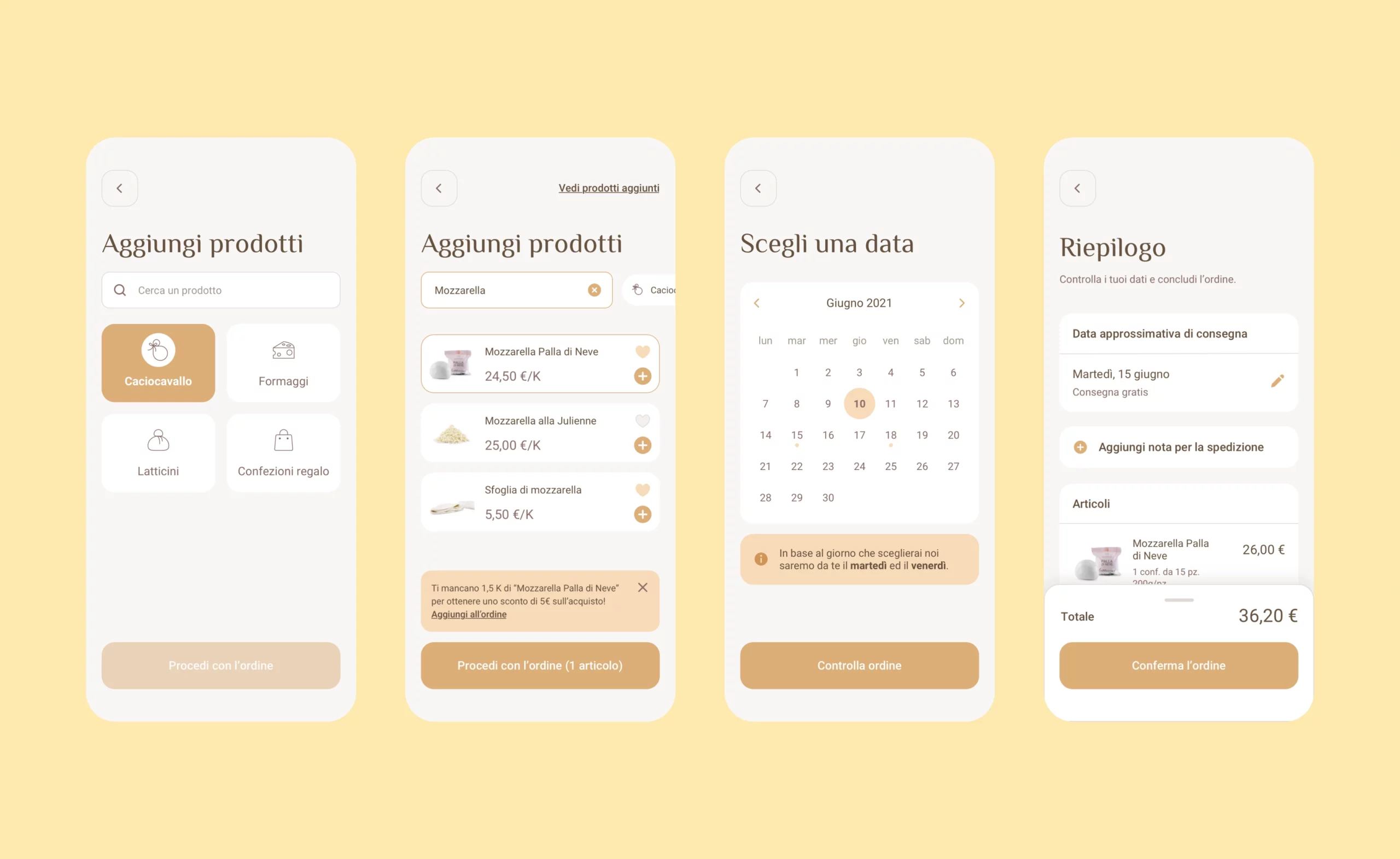
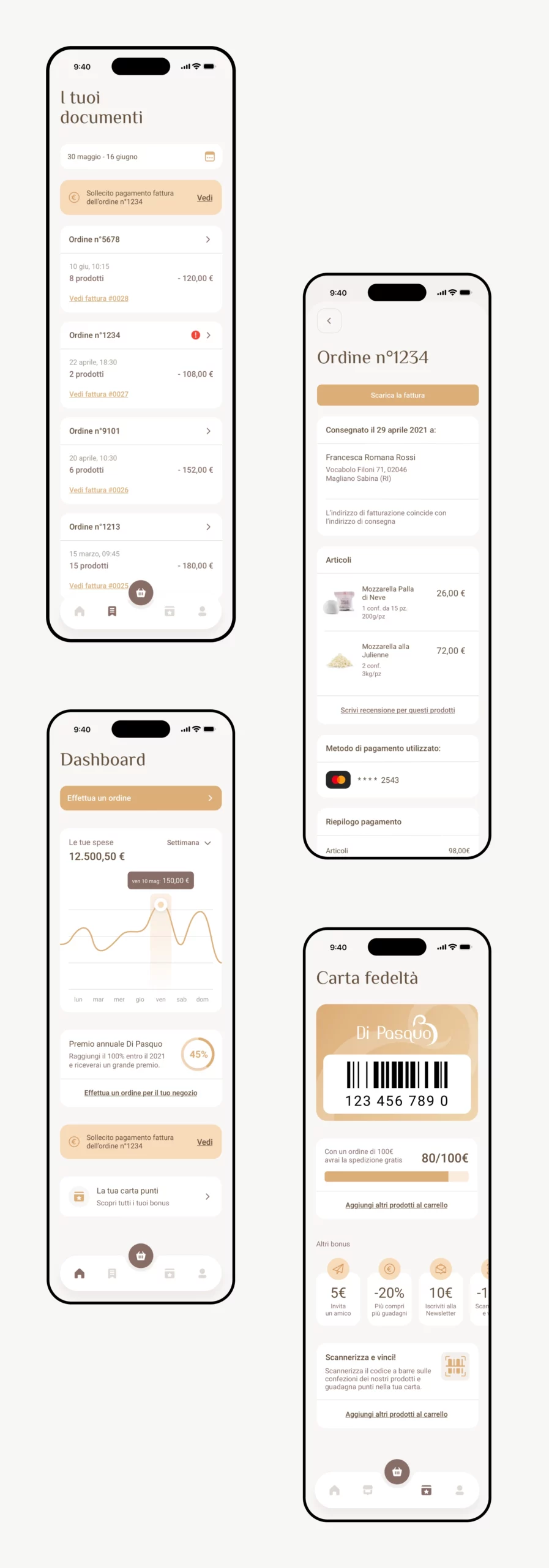
With payment-on-invoice agreements, retailers do not have to make payments for each order, as they receive a comprehensive invoice at the end of the month. This approach facilitates a long-term relationship, simplifying the purchasing process and allowing retailers to focus on the goods and services they want. Additionally, to increase conversions and sales, a banner with clear copy is used that encourages the user to add more products to obtain minimum spend discounts.
The dashboard includes a progress indicator below the timeline, reminding retailers of the reward system based on sales volume and brand loyalty. Incentives, such as product discounts and special offers, strengthen the relationship with repeat customers, encouraging them to continue purchasing.
Finally, the retailers’ page provides access to all documents related to business transactions, with invoices conveniently stored for efficient accounting management. The page also includes payment reminder alerts, ensuring retailers are always up to date on payment terms and deadlines.
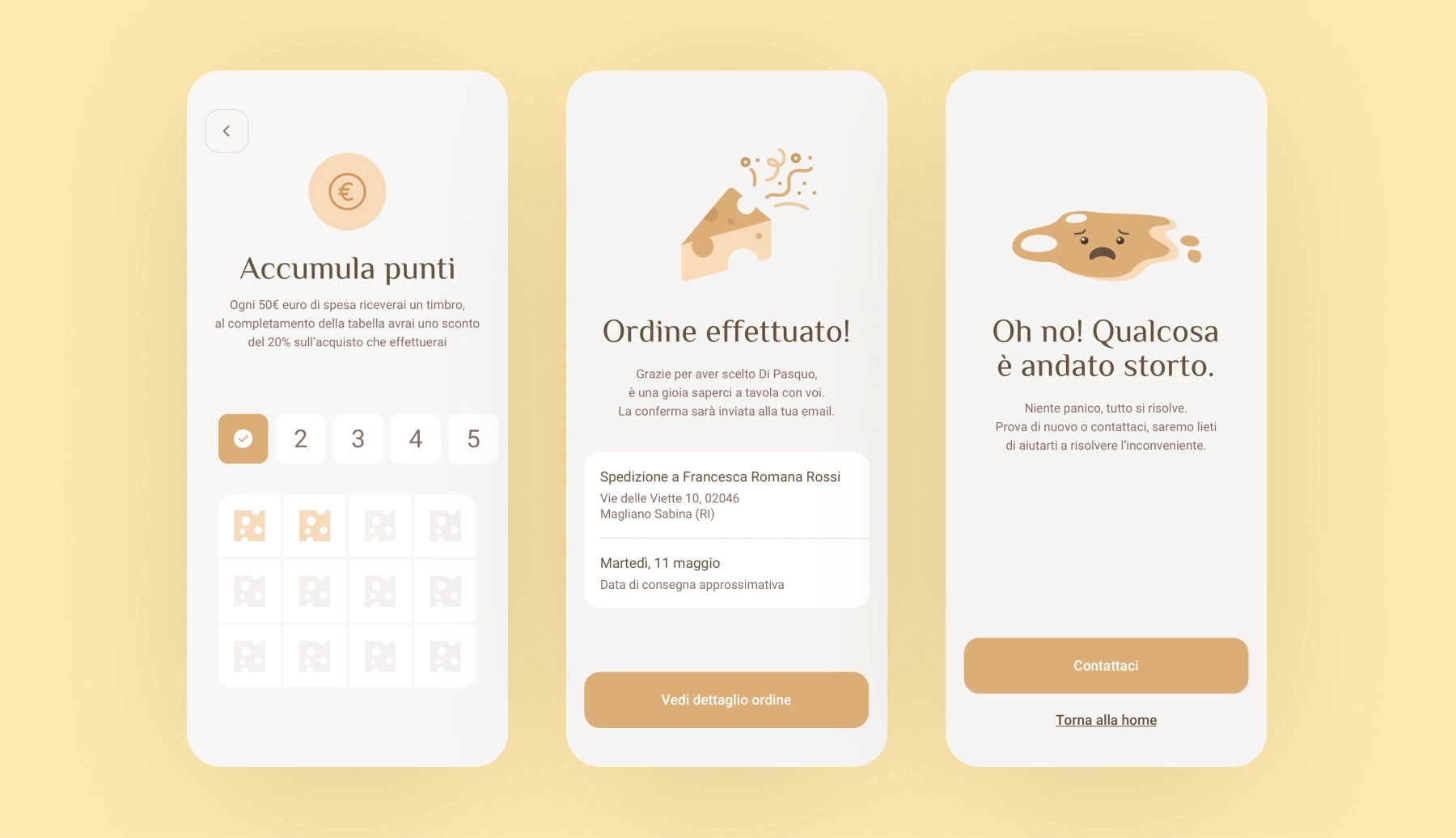
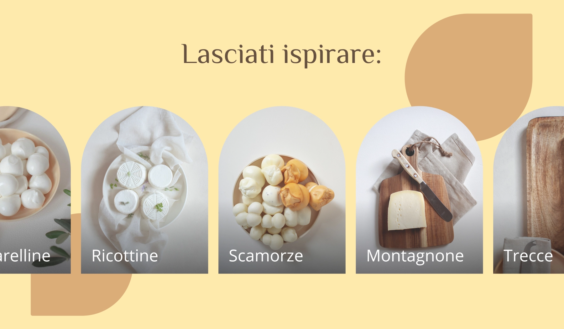
Custom graphics are vital for entertaining and strengthening your brand identity. Personalizing a brand’s images and icons helps to stand out from the crowd, but also to increase brand awareness and strengthen the emotional bond, promoting long-term loyalty, having fun and generating emotions.
In the B2C checkout, a progress bar guides users through each step of the process, while a banner actively encourages them to add more items to their cart for additional savings or benefits. A separate and streamlined checkout flow is dedicated to allowing customers to select gift options and packaging details, enhancing the personalization of their purchase. Additionally, it’s always recommended to prominently include the coupon code field on both the cart and checkout pages to maximize user convenience and boost conversion rates.
